Premium Visual Design
Created a clean purple-led visual system with stronger typography, spacing and hierarchy to give Xenon Labs a more professional and recognizable identity.
Case study — Xenon Labs
Redesign Xenon Labs into a cleaner, more credible and conversion-focused eCommerce platform for research products. The aim was to make product discovery easier, strengthen trust through quality and testing signals, and create a premium digital experience that feels professional across desktop and mobile.
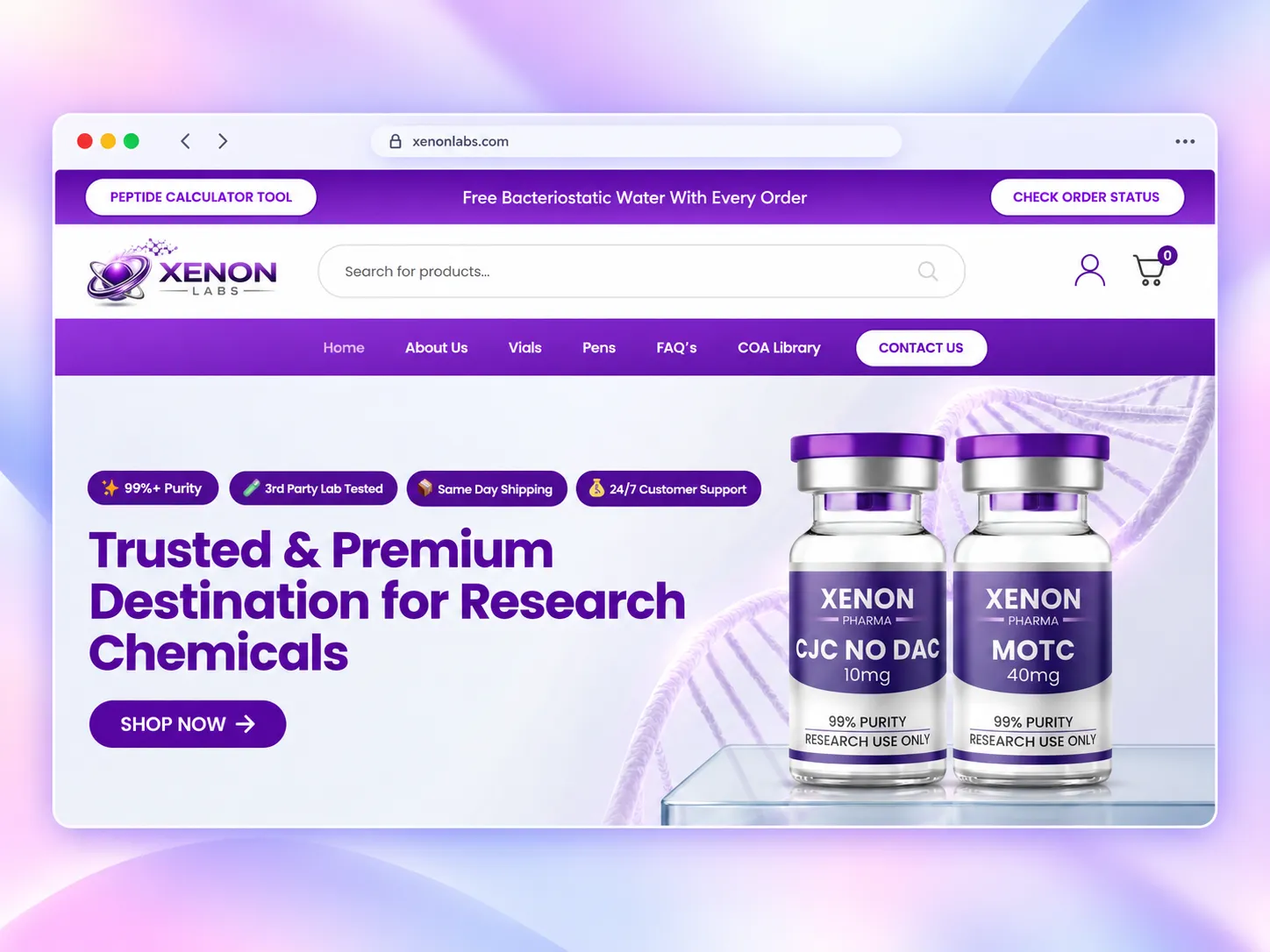
The website needed to present research products, purity information, lab testing, shipping benefits, COA access and customer support without making the experience feel technical or cluttered. The challenge was to organize all of this information while keeping the purchase journey simple, modern and trustworthy.
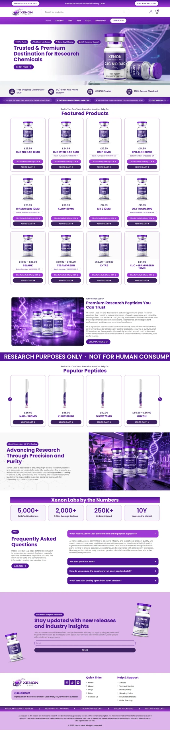
Created a clean purple-led visual system with stronger typography, spacing and hierarchy to give Xenon Labs a more professional and recognizable identity.
Improved navigation and product organization so users can quickly explore vials, pens, product categories and relevant research information.
Highlighted key trust signals such as 99%+ purity, third-party lab testing, shipping support and customer service in highly visible areas of the interface.
Made Certificates of Analysis and research-related information easier to access, helping users review quality documentation before making decisions.
Used clear calls to action, simplified navigation, strong product presentation and responsive layouts to create a smoother path from browsing to checkout.
The refined design gives Xenon Labs a more premium, credible and research-focused digital presence.
Clearer navigation and structured content make it faster for users to find products and understand key product information.
Prominent purity, testing, COA and service information helps reduce uncertainty and makes the shopping experience feel more transparent.
The responsive design provides a consistent and accessible experience across desktop, tablet and mobile while keeping important actions easy to reach.
Have a project in mind?